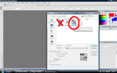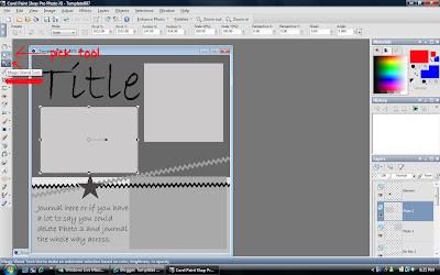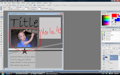
 Okay, now, with the marching ants around the place on the template where you want your photo, type Ctrl-Shift-L (paste into selection.) Your photo should now be in the selection box.
Magic. :) Type Ctrl-D to get rid of the ants.
Now, for the square photo at the top of this template, I need to select my next photo, but so that the photo doesn't get distorted, I need to turn that photo into a square. So, I use the crop tool. What I'm showing you in this screen shot is that you can tell it's a square because the crop tool tells you the measurements. That's something handy that I didn't notice until recently. :) Now, once I cropped the photo, I copied it. Then, I used the magic wand to select the square on the template, and pressed Ctrl-Shift-L again. Don't forget Ctrl-D to clear the ants. It's that easy! :) I suggest that you don't close the photos until you're completely finished with the LO, just minimize them. Just in case.
Now that I've been staring at the Template for a little while, I pretty much know where things are, so I delete some layers that I don't need. In this case, the text, star, and ribbon, because I'm going to replace them with my own. You can delete a layer two ways: on the layers palette, right click on the layer and then choose delete, or right click on the object and click delete.
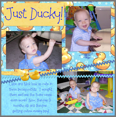
Then, add elements just like any other LO.Okay, that's the main part of the template tutorial. Here are some tips for finishing up the layout.
When you add a new element, it might not be in the order that you want it to be in, you can move them around by right clicking, click arrange, then choose where you want the element to go. Or, you can actually move them around on the layers palette; just click and drag.

Normally, I would delete the ric rac in my template and replace it with a ric rac that a designer made (because they do things to make it look more realistic), but in the interest of showing you some other handy tools, this is what I did this time. In the right hand corner, you'll see two color boxes. Click on the top one and a menu that looks like this will pop up:

You're mouse will also look like a dropper. Use the dropper to pick up a color somewhere on the page. This is a great way to make sure that your journaling matches your LO exactly. Click okay. I've also circled the ric rac because you can see that I've selected it with the magic wand. Now, I use the paint bucket (flood fill) tool and click inside the marching ants and my ric rac turns blue. :)
Finishing touches, drop shadow:

The zoom is always way too close. Usually something around 5-10 works much better. As far as settings, for most things I use a number between 4 and 6. I might go up to 8 for something that is obviously thicker, like chipboard, but anything higher than that, and it looks like it's floating off the page. Make sure that the box next to shadow on it's own layer isn't checked. That's annoying unless you need it to be a separate layer for some reason. Also, I never add a drop shadow to my text layers.

Make sure you choose "save as" to save your LO, otherwise you'll save over the template and you won't be able to use it again.


4 comments:
Great tutorial!! Thank you.
Thanks, great tutorial.
I would just like to say thank you very much for the tutorial. Thanks to you I have finished my first layout using a template.
Thanks! Very helpful!!
Post a Comment